How We Made Research Lab Discovery Less Intimidating for College Students
april 1, 2026
Accessible lab discovery for all students in UC Davis
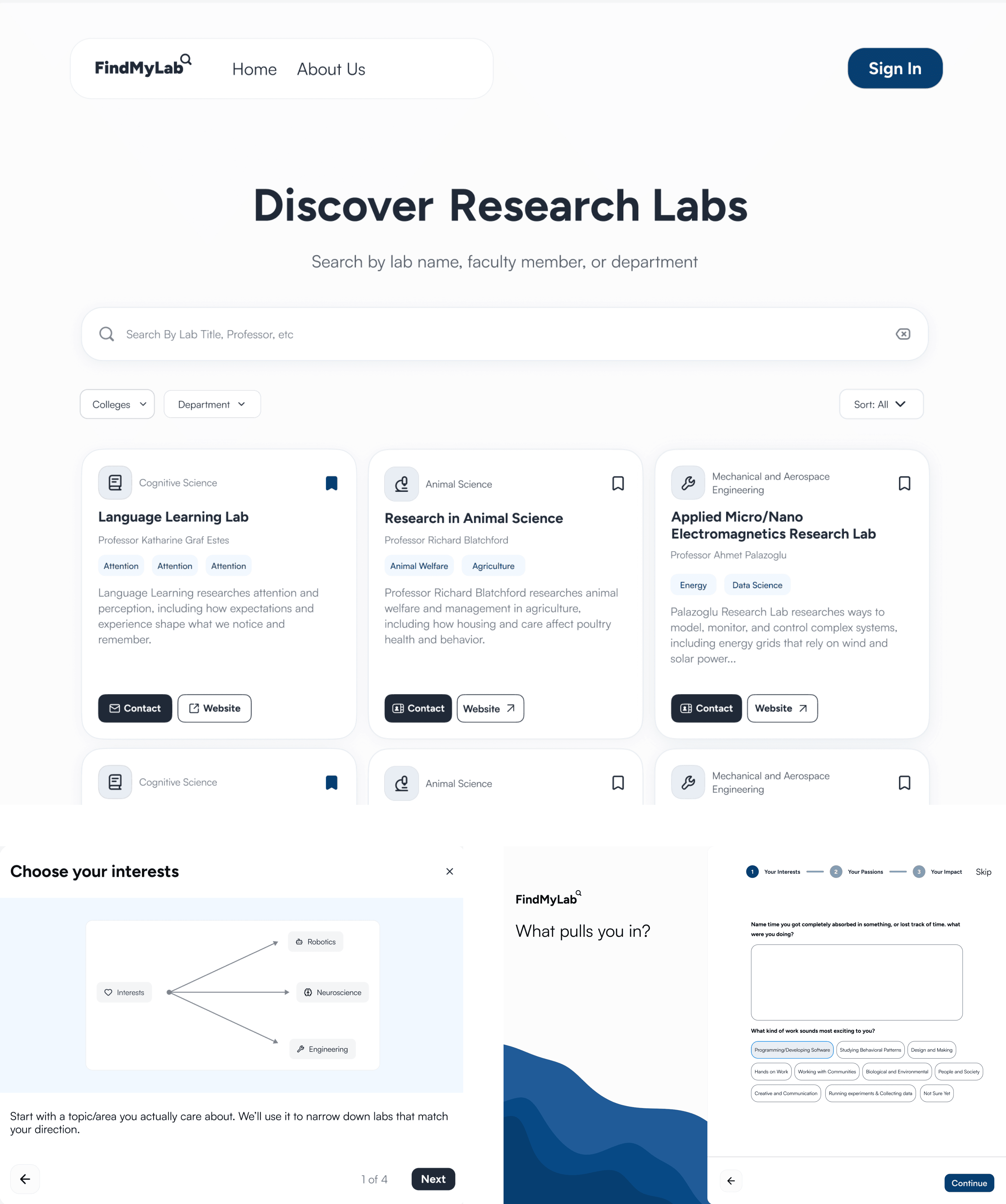
FindMyLab is a student-focused research lab directory built through AggieWorks, a student-run organization creating technology for students. It allows users to explore active labs, filter opportunities by field, and will soon offer personalized matches based on their interests. The goal is to make research more accessible and reduce barriers for students at UC Davis.
OPPORTUNITY
Finding a research lab at UC Davis is
harder than it should be
Students often have to search through faculty pages, outdated listings, and informal networks just to find one opportunity. Those without connections or knowledge of cold outreach are often at a disadvantage.
Research
We wanted to see how UC Davis students felt about approaching labs.
After distributing flyers and sending outreach emails across campus, we gathered over 200 responses and conducted around 20 student interviews to better understand their lab application experiences. From these interviews, we grouped the students into two types of users.
Daniel Chan, a first year at Davis
A first-year student with no prior research experience who isn’t sure where to start. He tends to browse broadly, feels intimidated by academic language, and needs a directory that feels approachable and easy to navigate rather than overwhelming.
Ryan Wong, a Third year at Davis
A third-year student with some lab experience who has a clearer sense of what he’s looking for. He searches with specific keywords, compares multiple opportunities, and gets frustrated when key details are missing or hard to find. He needs a directory that is efficient, structured, and information-rich.
HMW STATEMENT
How might we enable UC Davis students, from those new to research to experienced applicants, to efficiently discover and assess laboratory opportunities without only relying on personal connections or the uncertainty of cold outreach?
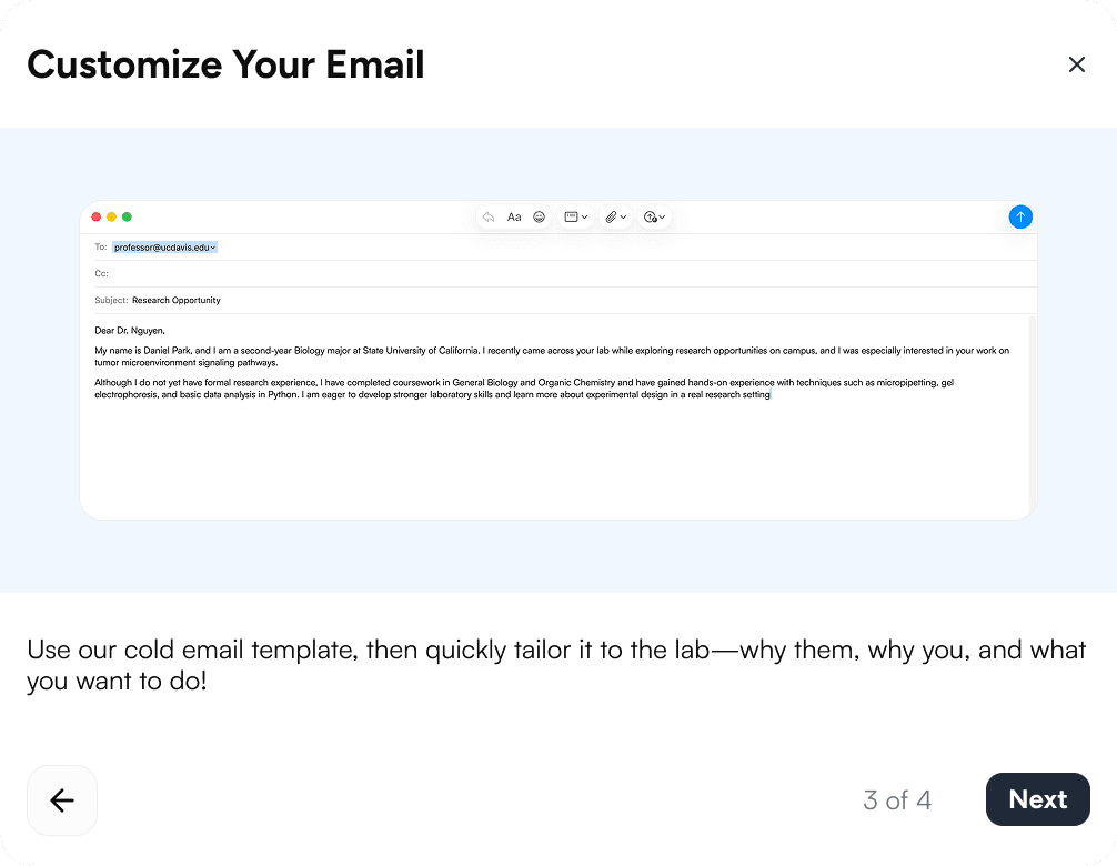
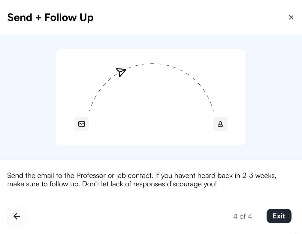
Design Decisions
Designing for Newer Students
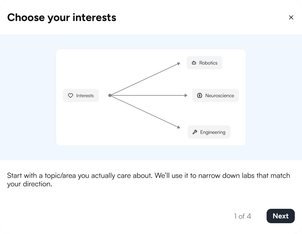
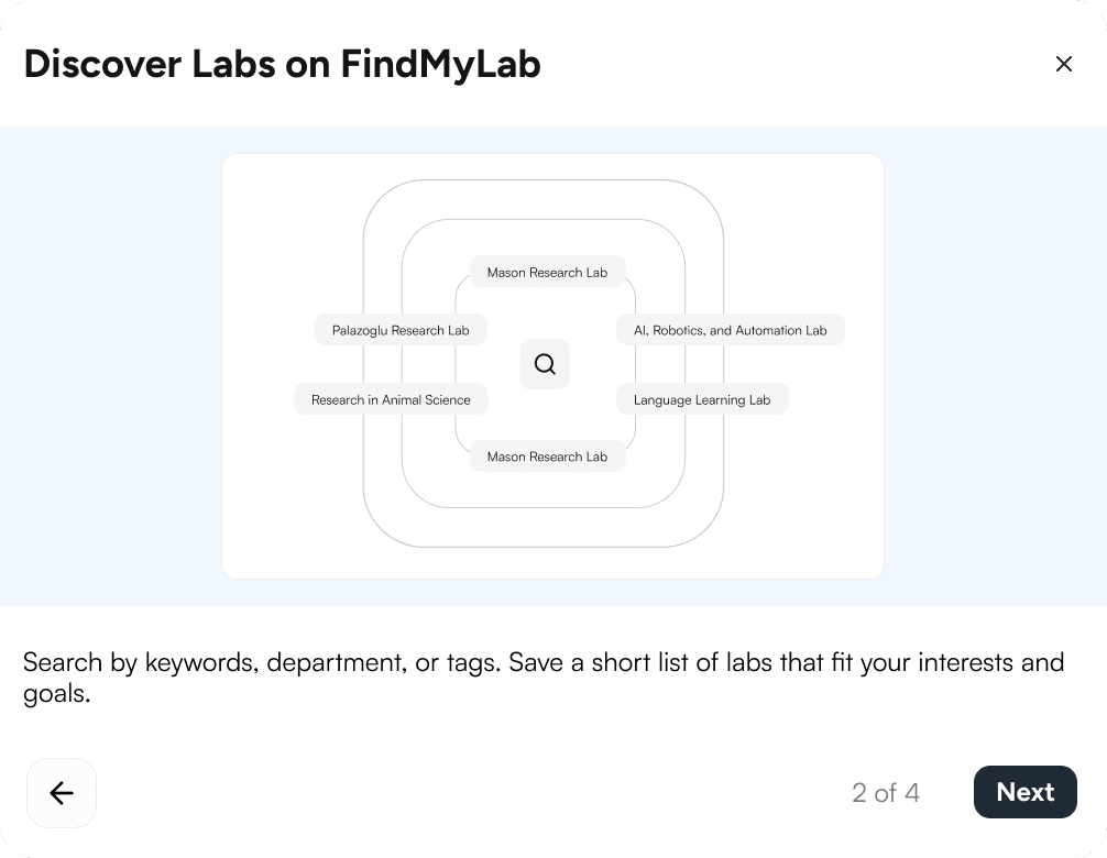
Daniel’s main barrier isn’t just the fact that labs are hard to find. It's understanding how research works. A list of labs also doesn’t help if he doesn’t know what they do or what his role might be. As a way to address this, we created short and simple infographics that explain the research cycle and what students actually do, giving him the context he needs to find their next lab. .
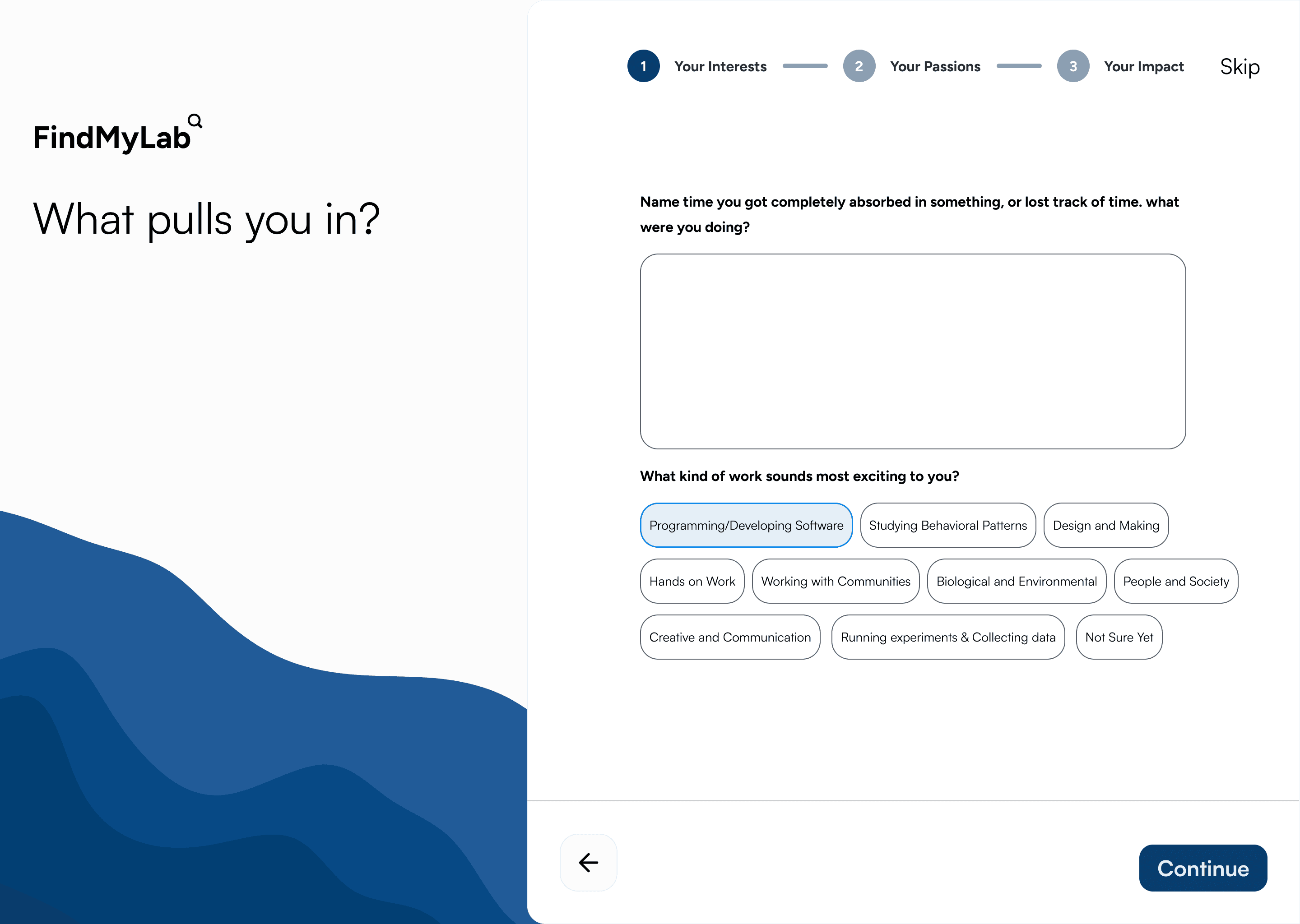
Designing for More Experienced Students
Improving a filter bar students weren’t using. PostHog data showed 70% of users scrolled past it because they didn’t notice it. Instead of adding more filters, which could overwhelm newer users, we focused on visibility. Inspired by Airbnb, the redesign makes search and filtering the first thing users see. In testing, 6 out of 8 students engaged with it before scrolling, a clear improvement.
Quicker way of connecting students to labs
For newer students like Daniel, the questionnaire gives a clear place to start, and for experienced students like Ryan, it shows labs that match their major, experience, and research interests so they don’t have to spend time browsing. This turns FindMyLab from a simple directory into a helpful tool that makes finding the right lab faster and easier.
Feedback
"I was able to easily navigate the website, find labs I was interested in, and the lab website was easily accessible through FindMyLab."
"Site was easy to use and very clear — I have dyslexia and it's hard to read sometimes."
Reflection
What I learned
Designing for two distinct student types showed how small details can shape the experience. A poorly placed filter bar creates friction for Ryan, while a list of labs without context can feel overwhelming for Daniel. This shifted how I approach design decisions, with a stronger focus on both accessibility and efficiency.
What I would do differently
Early sprint planning was messy for us. With two PMs, two engineers, and one designer, we often worked in parallel without clear alignment on priorities. A stronger sync system earlier on would have helped surface and ship high-priority features sooner. We also should have used tools like Maze for early A/B testing to validate decisions faster and reduce ambiguity during development. We delayed full visual branding until the core product felt stable. While prioritizing functionality was the right call, earlier alignment on visuals could have made the process more efficient.