Case Study: AMP Parking App
How Visual Design Strengthens User Trust
Introduction
Problem
At schools like UC Davis, students and staff are actively avoiding the campus parking app, with some choosing to risk parking tickets rather than use it for payment. With over 10,000 students on campus and daily parking fees, this represents significant lost revenue and compliance issues. Reviews point to a breakdown in trust, citing issues with reliability and user experience.
Opportunity
How might we rebuild user trust to create a parking app that students feel comfortable using instead of actively avoiding?
Research
For this project, I set out to understand how successful platforms build trust within their communities. I began by examining the factors that cause users to abandon apps. At first, I assumed the issue was just an unpolished UI. After reviewing more than 50 app reviews, however, it became clear that the real problem was a breakdown in trust. Here are the key insights that emerged:
Trust Crisis
The app’s unpolished look makes users perceive it as shady and unprofessional.
Students calculated that a $30 parking ticket was preferable to the emotional stress of app failure which emphasizes how broken experiences can cause irrational decision making
Entering card details feels unsafe, leading to hesitation and loss of confidence in payment security.
Negative reviews created a community of distrust within the app, as students reviews indirectly warns each other away from the app
Usability Issues
An outdated UI drives users away and reduces overall engagement.
Poor labeling and unclear error messages make it difficult to recover from mistakes.
Lack of Apple Pay disrupts familiar patterns established by other apps, creating unnecessary friction in payments.
Competitive Analysis
I analyzed apps like ParkMobile, Amazon, and Uber to understand how businesses build user trust. ParkMobile, the direct competitor, offers a modern UI, clear labels, EV parking options, and convenient payments like Apple and Google Pay. Uber and Amazon show how smooth payment systems boost confidence. Applying these insights to AMP Park can improve its usability, reliability, and trust.
Strategy
Early on, I considered two approaches: adding incentives like discounts or rewards to bring users back, and redesigning the interface to simplify layouts and hide complexity. While these methods could improve the app, they did not address the core issue. Consumers had lost trust in its reliability. This insight led me to apply Ken Thompson’s Trust Framework, focusing on Ability, Benevolence, and Integrity.
The Trust Framework
Ability: Users struggled with unclear labeling, outdated UI, and slow core tasks, leading to frustration and app abandonment.
Benevolence: Students felt the app didn’t care about them, especially when payments failed or UI issues persisted.
Integrity: Generic fonts, inconsistent design, and missing trusted payment options lowered confidence and credibility.
Design Solutions
Design Requirements
The redesign aimed to make the app intuitive, reliable, and user-focused, addressing trust issues uncovered in research.
Redesigned UI for a faster and more intuitive navigation
Modernized payment system with trusted providers for secure transactions
Updated typography, spacing, and visual patterns to enhance professionalism
Create a more notable first impression to build a better relationship between the company and the customers
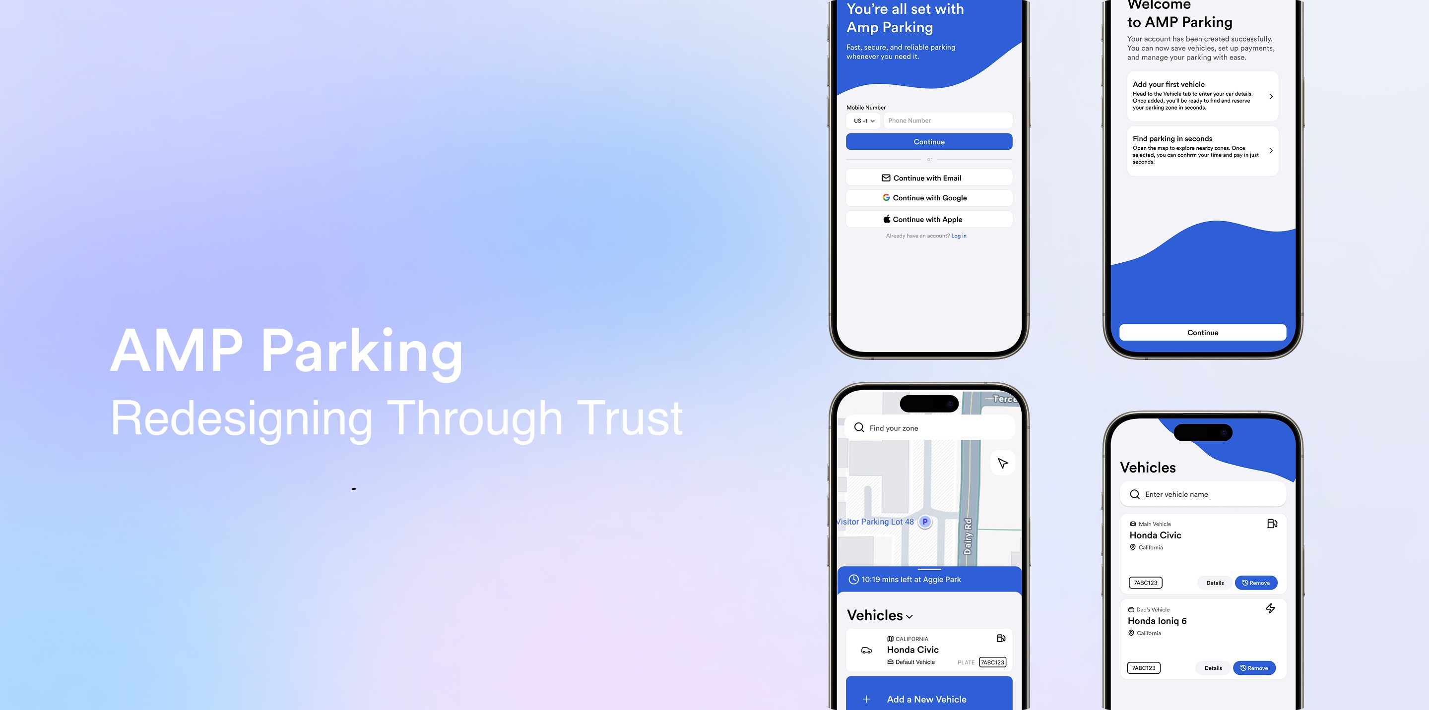
Crafting the -
Product
Parking Flow
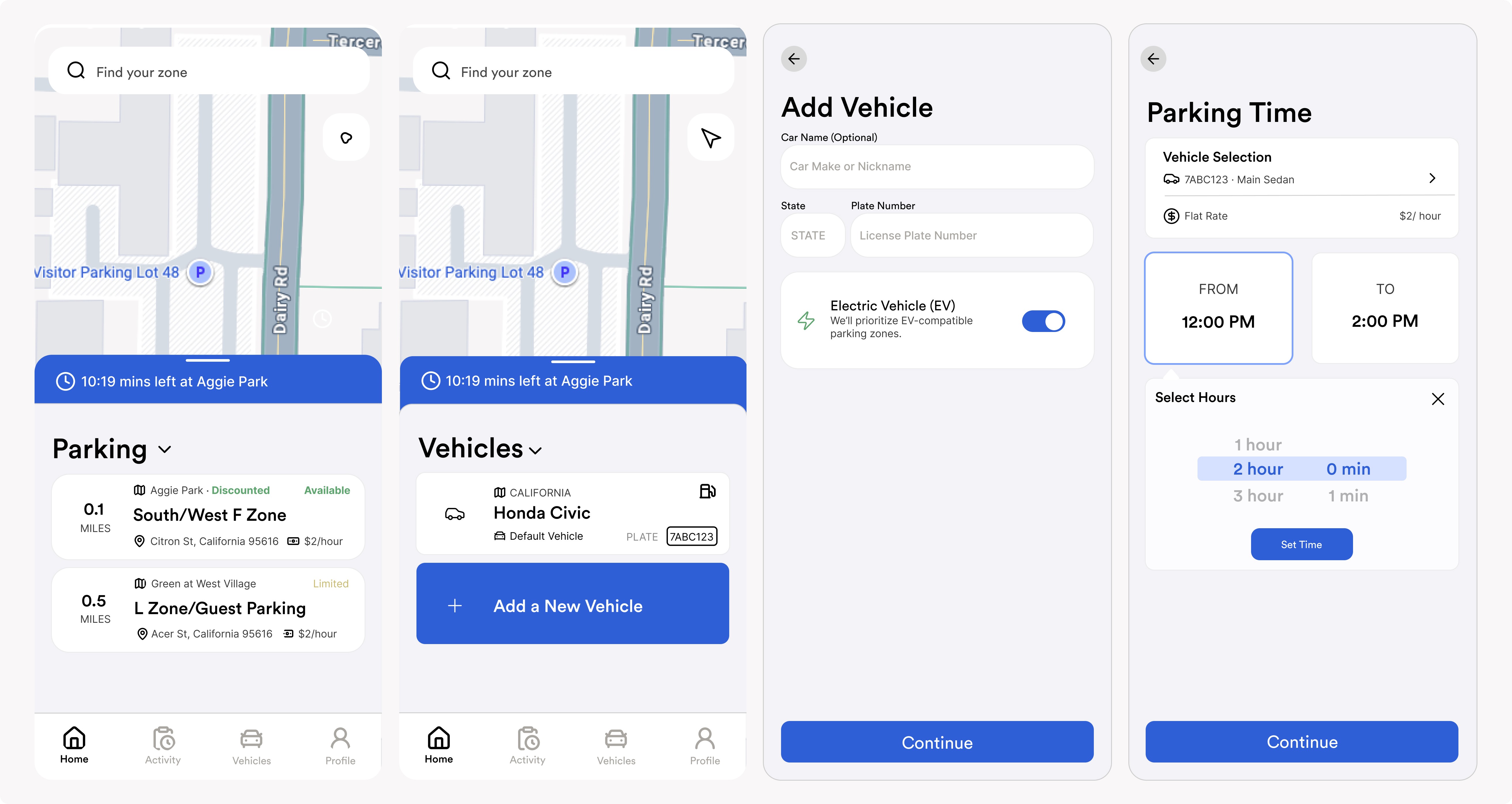
I introduced a slide-up bar that guides users through payment, starting with selecting a zone, adding a vehicle if needed, confirming time, and paying. A dropdown lets users quickly switch between available spots, active parking, and favorites.
A Trust First Payment
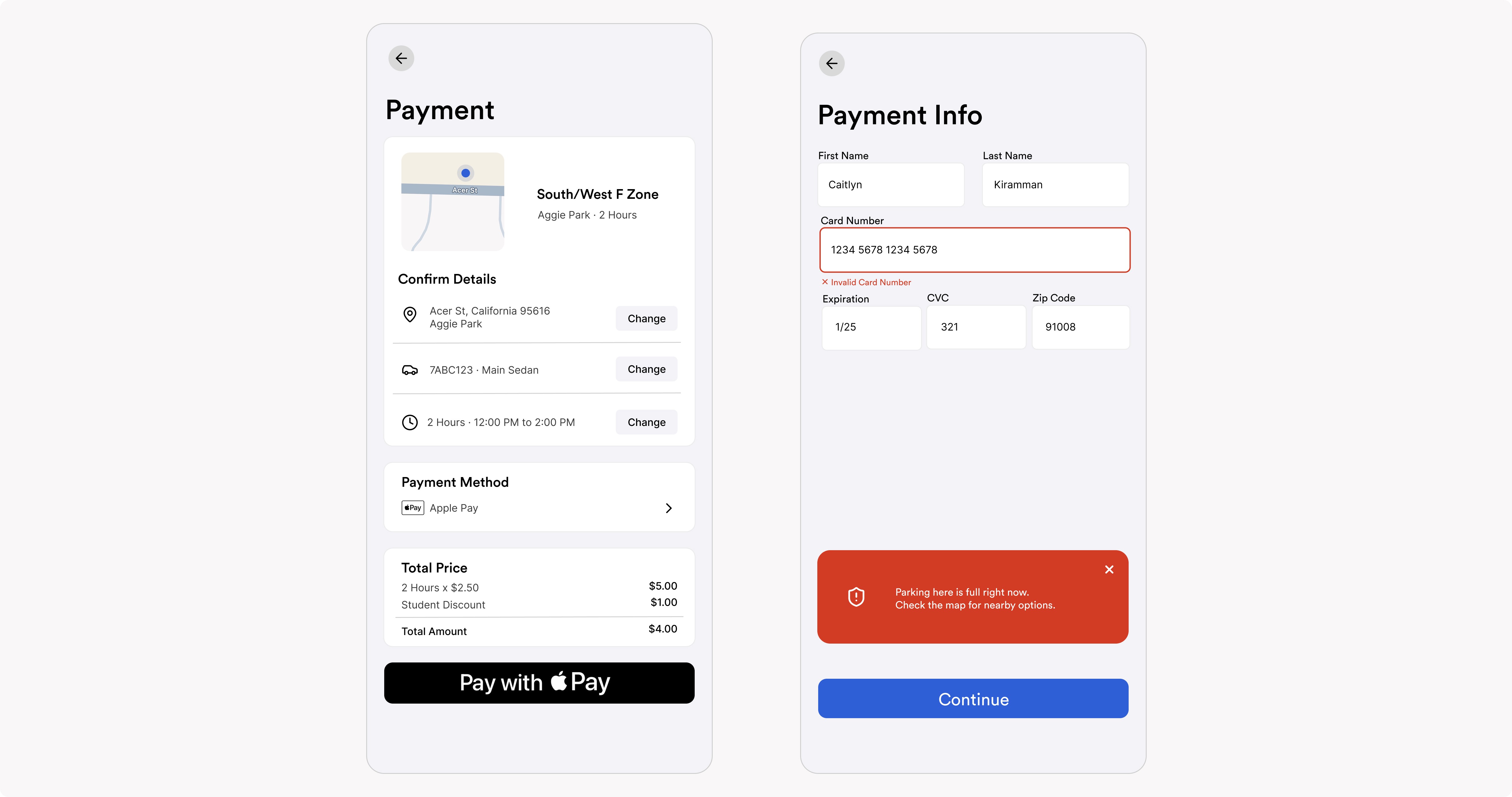
Apple Pay and Google Pay were made the primary payment methods to reduce friction and build trust. Error codes were later added in mid-fidelity to improve clarity and prevent confusion.
General Improvements to UI and Navigation
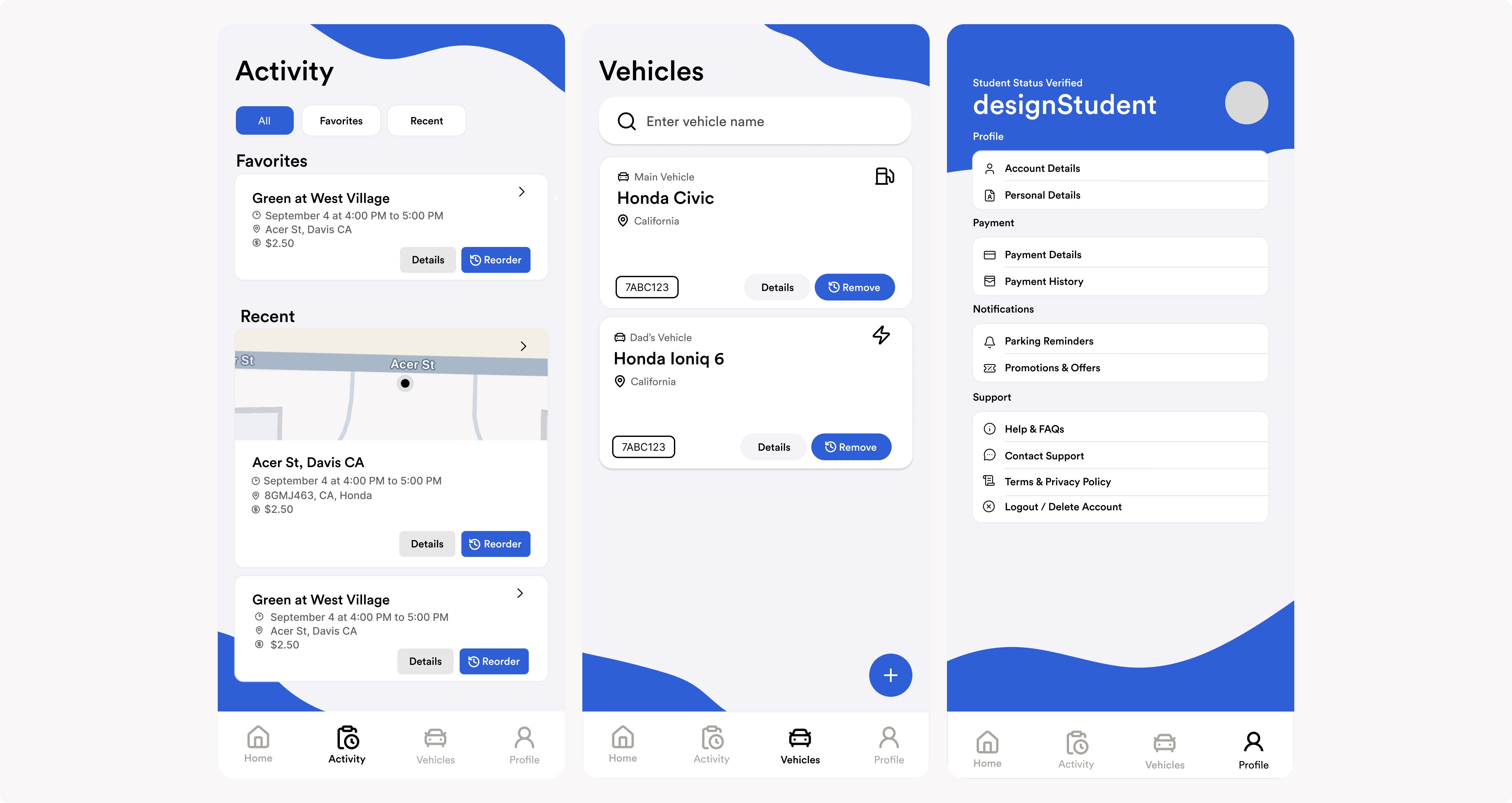
I adopted familiar design patterns from apps like Airbnb, Spotify, Google Maps, and Instagram to improve overall usability. The Hamburger Menu was redesigned into Home Navigation for easier access, the History tab became Activity to help users filter past parking transactions, and the Vehicle and Profile pages were updated from a cramped list format to card-based layouts with better grouping for clearer hierarchy.
More Credible First Impression
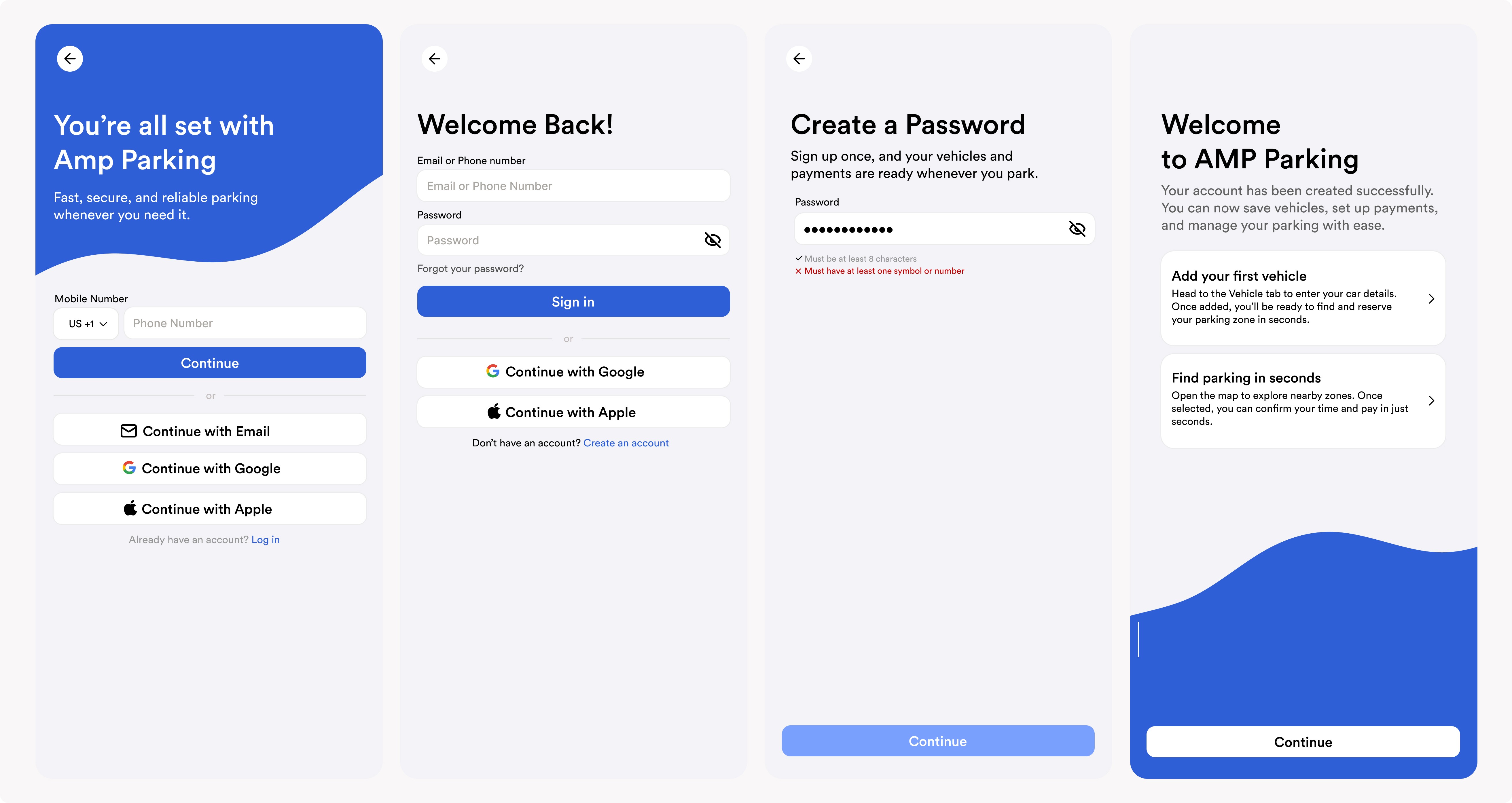
I redesigned onboarding to create a stronger first impression and reduce early abandonment. Sign-up was simplified, labels and requirements were clarified, and step-by-step guidance was added to help users get started confidently.
Low-Fidelity Draft

I created low-fidelity wireframes to explore ways to rebuild user trust through design. Early sketches focused on simplifying layouts, clarifying error states, and improving payment flows to address usability and reliability concerns. These prototypes helped visualize how transparency, consistency, and modern patterns could restore confidence before refining the visual design.
User Testing
Testing & Feedback
I tested the prototype with four students, including new users and those familiar with the old app. They completed three tasks: paying for parking, reserving a spot, and accessing student discounts.
Key findings showed daily parkers completed tasks easily, confirming the redesign addressed pain points. Users frustrated by silent failures led to adding clearer, more prominent error messages to improve transparency and trust.
Reflection
Key Learnings & Growth
I learned how to design for a wide range of UC Davis students, from tech novices to frequent app users, even with limited testing resources. I discovered the power of visual design in building trust through Ken Thompson's framework, and how to transform user complaints and critiques into actionable, user-centered solutions.
With more time, I’d expand testing to include more diverse users, run a thorough accessibility audit, and add animations and interactive touches to give the app more character and strengthen its brand.